
about
highlights
‘23 | Green Parks & Yellow Lights - pixel art
‘24 | “Bọ” - experimental performance
‘24 | “currents” - a short story
‘24 | “Silence” - hand-drawn cyber animation
‘23 | “my heart yearns for gaia’s embrace” - photo series
‘21 | ‘Dấu Chấm Tròn Xanh’ music video animation
‘23 | “The Sense of Self” music & sound design
‘20 | “Hikaribakuh” pixel art animation
‘19 | “Obscure” animation
ongoing practices
sketches - drawings - posters
photos
dance
other adventures
‘19 | Chairs Morphing - a study of chairs
‘19 | “Tùng Nai” - artefact study + wearable design
‘21 | “Mecha Buffalo” - concept art
‘20 | Miliket Noodles Rebranding
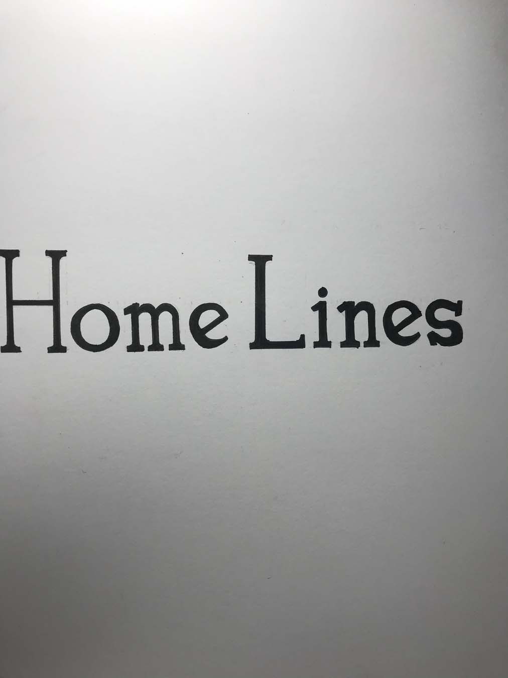
‘21 | HOME LINES Rebranding
‘20 | “Granny’s House” - 3D recreation
‘19 | “Arduin” - 3D Character Concept
‘19 | “Does Not Exist”- VR prototype

rebranding proposal for a former luxury cruise line brand
Medium: 2D Graphics
Outcome: a logo and semi-complete branding for Home Lines
Year: 2021
Time spent: 1 month
HOME LINES (1946-1988) is an Italian passenger shipping company that operated both ocean liners and cruise ships,
considered one of the top three operators in the transatlantic passenger business.
Before falling apart in 1988, they were one of the most highly regarded cruise lines in the world.
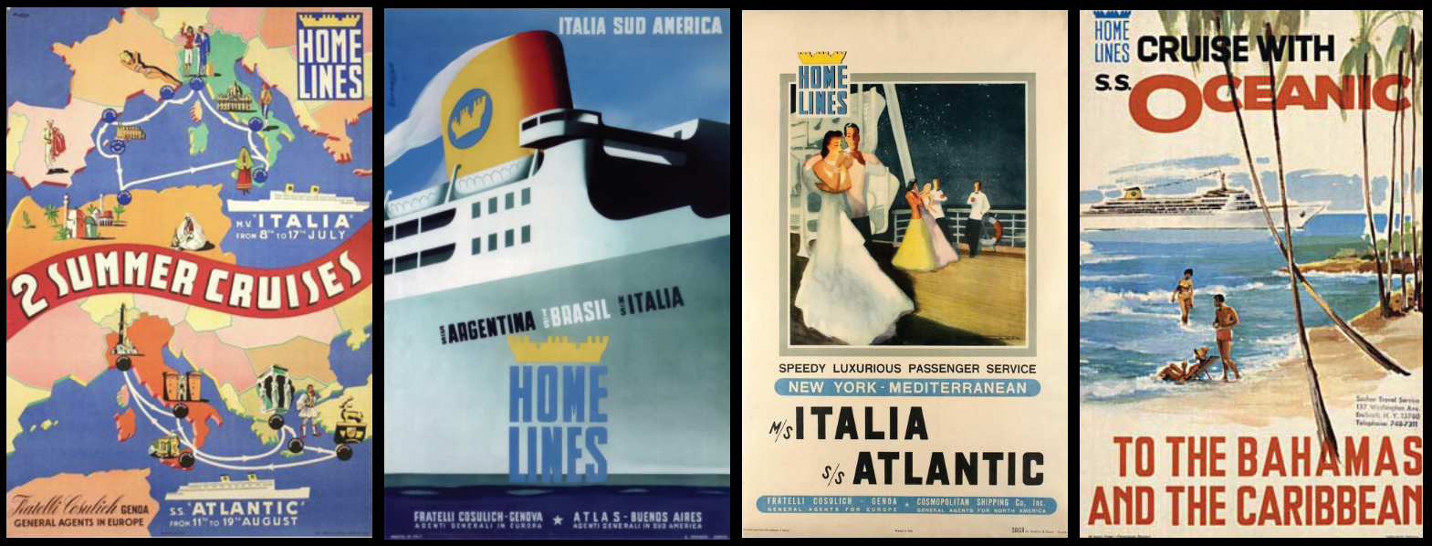
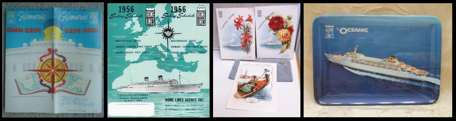
HOME LINES’ beautifully elegant brand touchpoints - capturing the explosion in cruise travel of the 1950s

The general picture of HOME LINES’ former services and clientele was luxurious, leisurely and modern.
My assignment tasked me with reviving the this prestigious brand for the 21st century Vietnamese context.
People are richer now and their demands have grown, or is still growing exponentially.
The wealthy now have more diversity in their travel options than ever before.
They seek for greater value for their investments.
Along with a different generation of potential customers, the business of luxury travel has also changed. Cruise liners of the past have been replaced by ultra-modern, humongous Cruise ships, with on-board hotels, casinoes and movie theaters that carry can up to 6000+ people. A blooming but relatively young section - the private market, that caters smaller but more exclusive customers with even fancier yachts and superyachts.
This is precisely the right direction for Home Lines’ re-emergence in the contemporary times. To expand and utilize a greater variety of services and channels while aligning itself with these standards, through its professionality and quality of service.
Regarding design, the task was also too develop a new logo & branding package for the new HOME LINES.
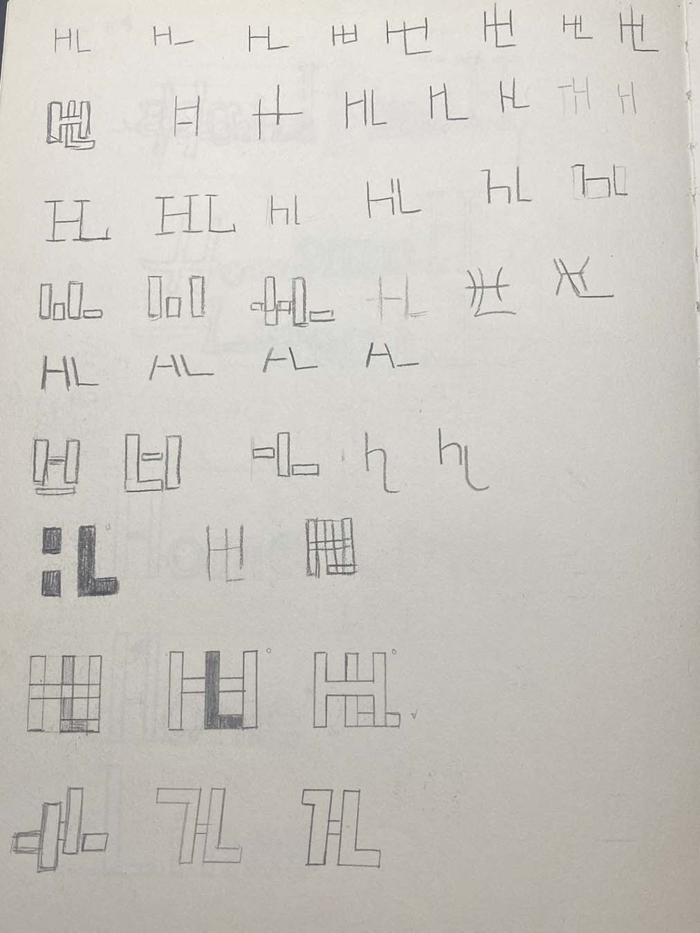
For the logo alone, there were 6 types I needed to develop:
-
Logotype (a logo that involve text or letters)
-
Monogram
(a logo that involve text or letters, but just the initials)
-
Pictogram (a logo that resembles a physical object)
-
Abstract (similar to a pictogram, but less obvious)
-
Mascot (
one that bears an image of an identifiable brand ambassador, often an animal or cartoon)
-
Emblem (text inside a border, fused seamlessly with graphics)
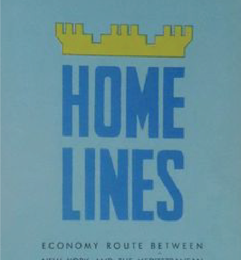
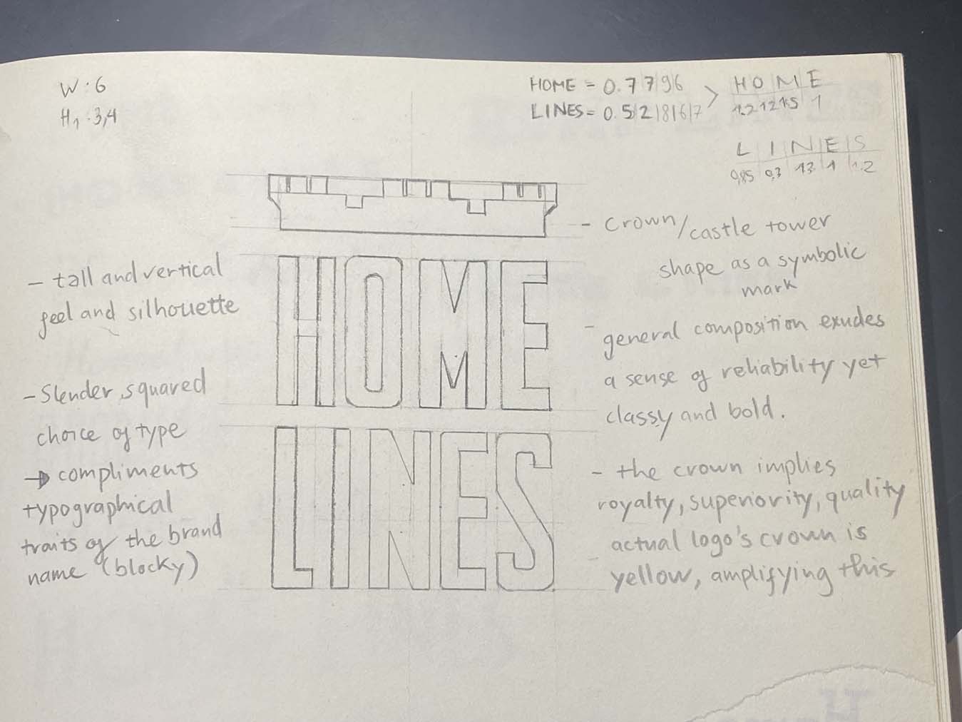
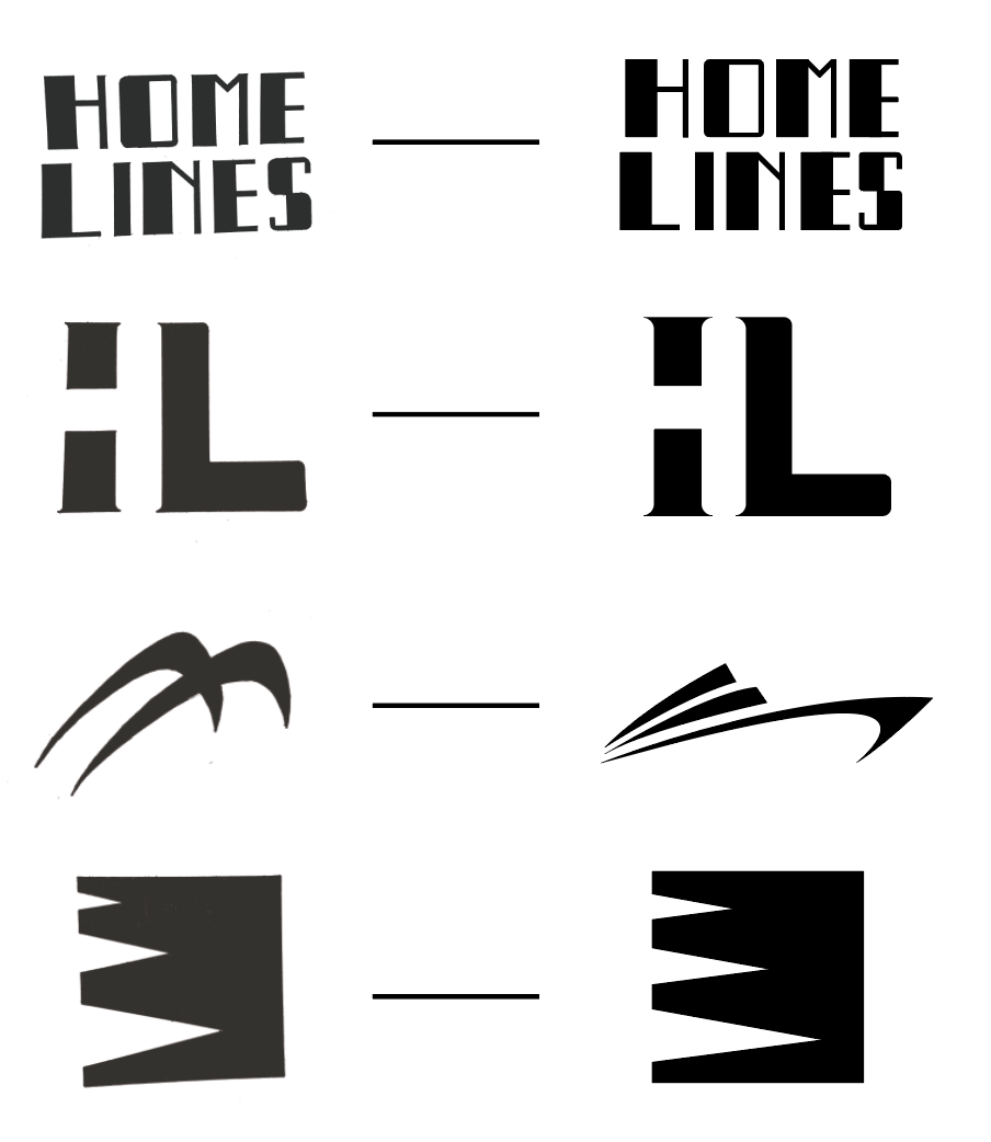
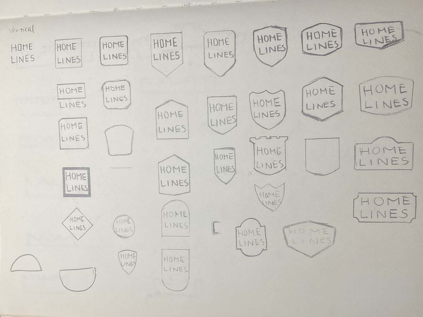
I had to, of course, dissect the former logo.
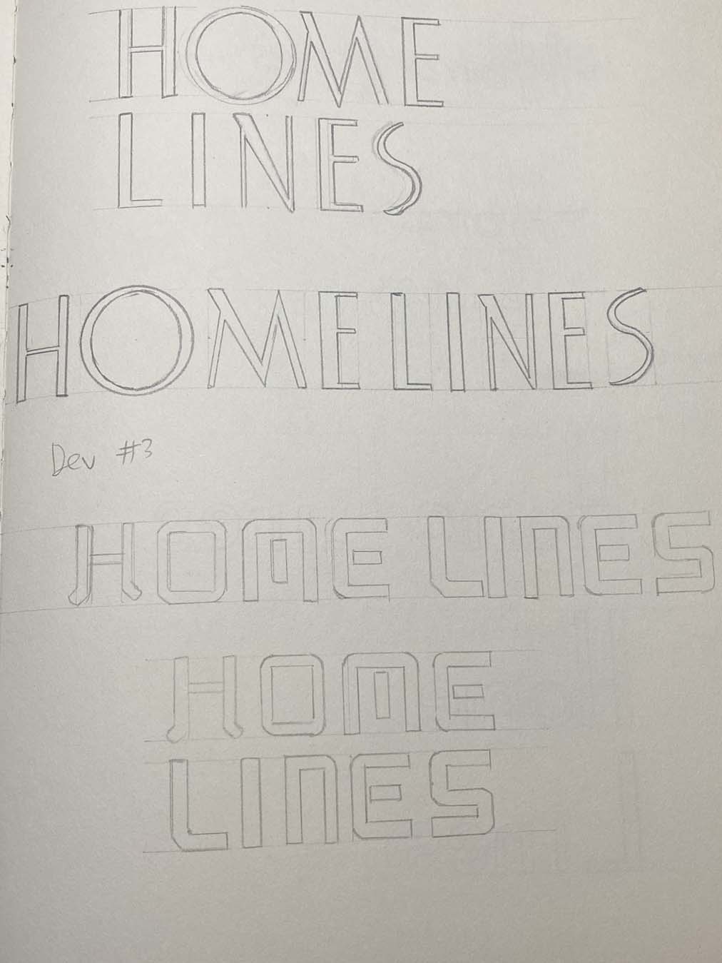
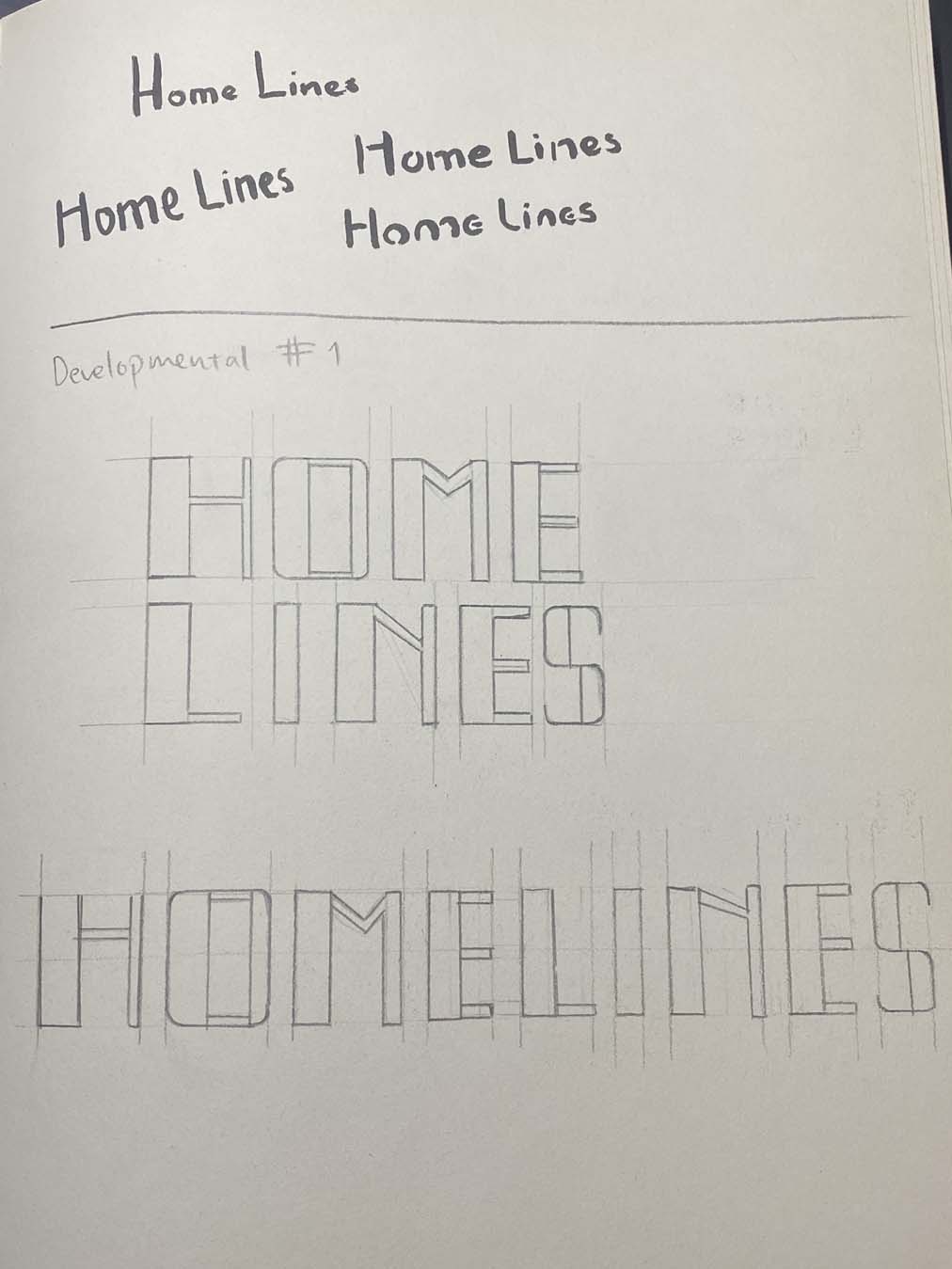
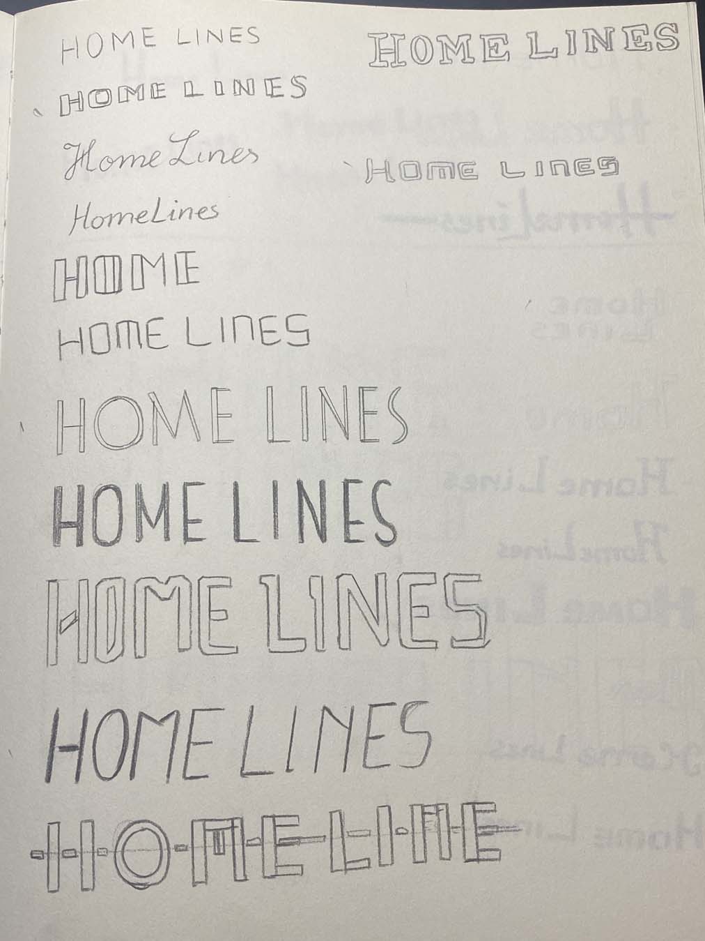
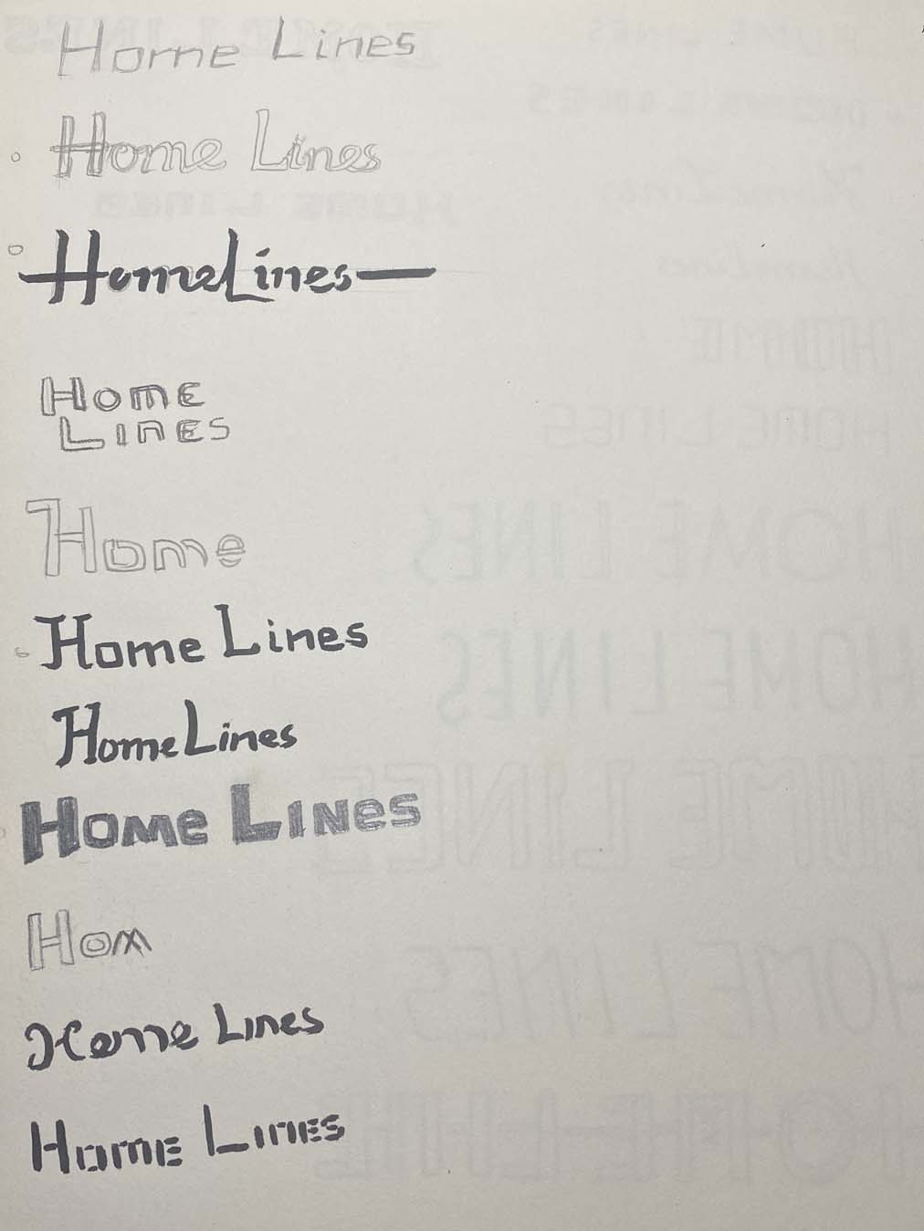

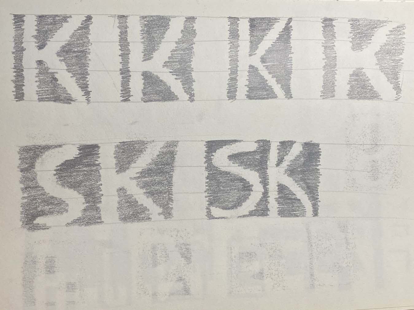
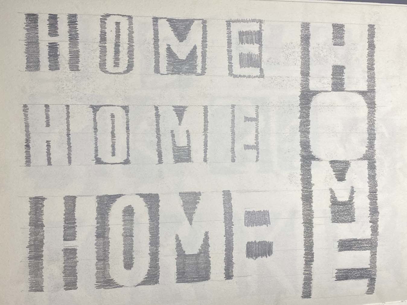

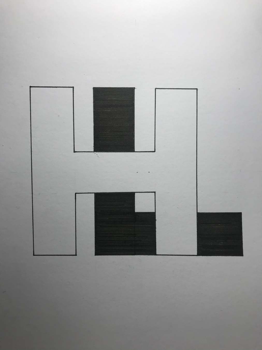
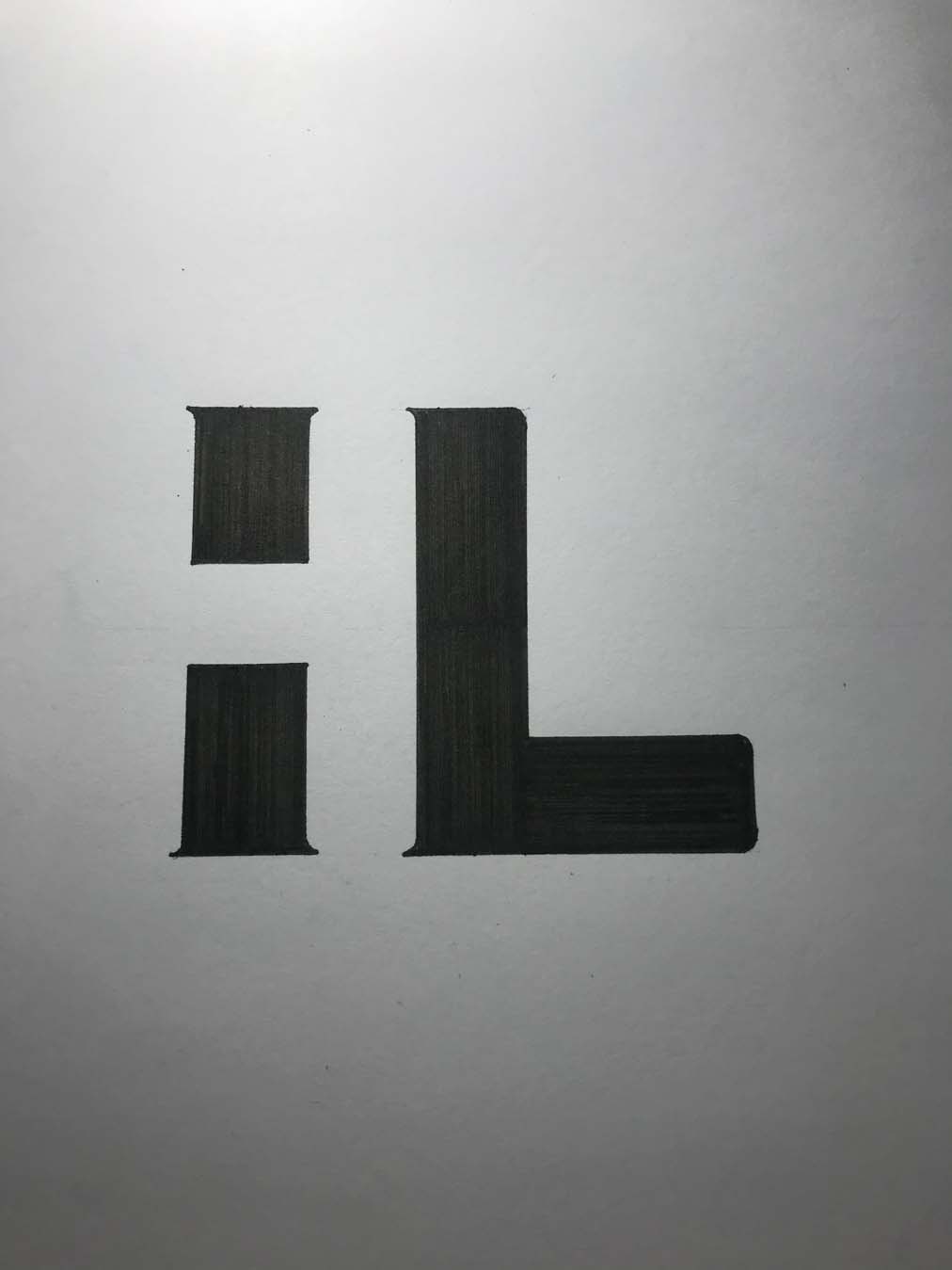
Exploring logotypes, finding out that ‘HOME LINES’ is a very rectangular-shaped silhouette
![]()
![]()
![]()
![]()
![]()
![]()
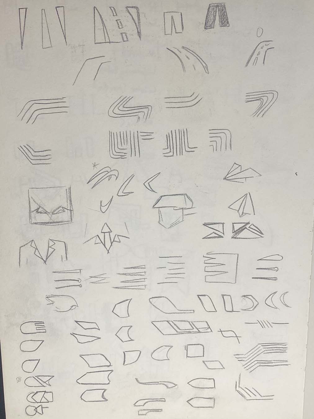
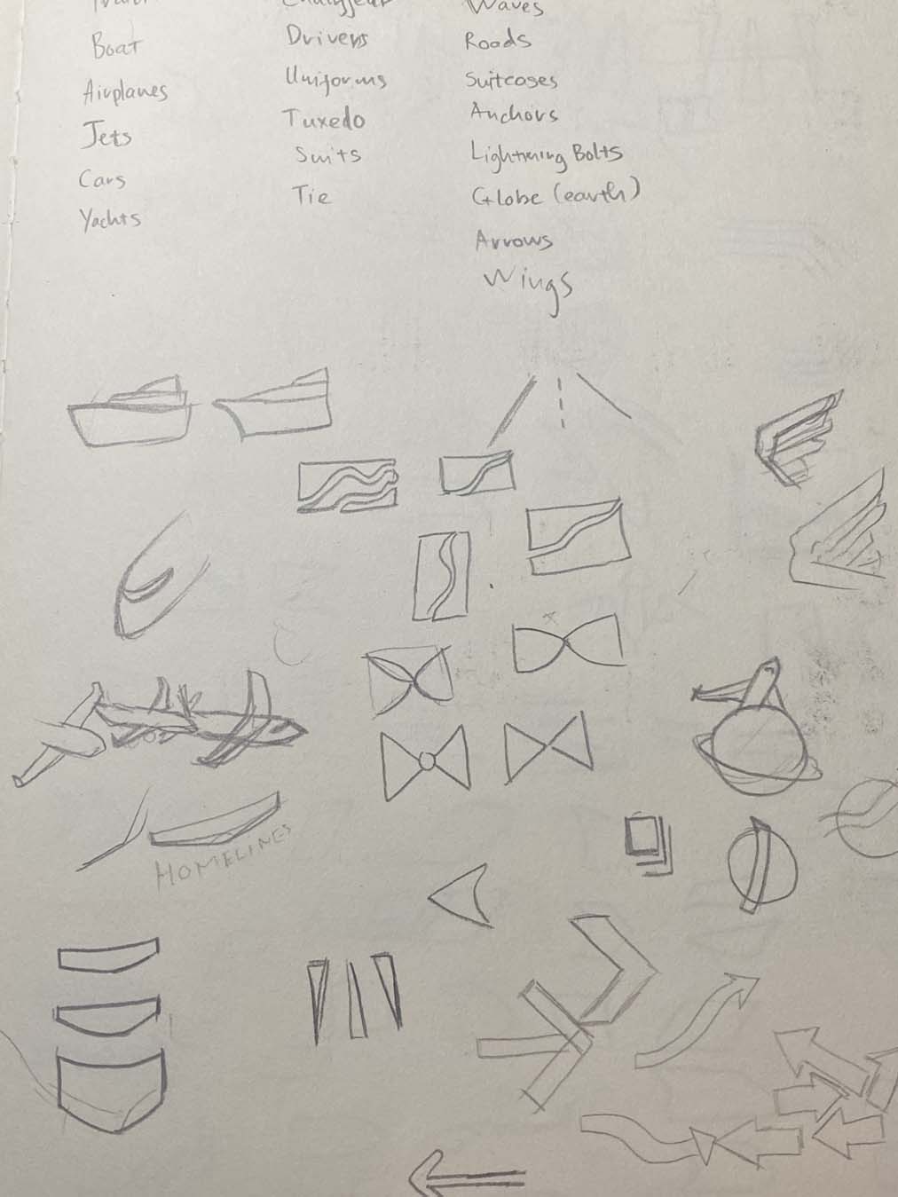
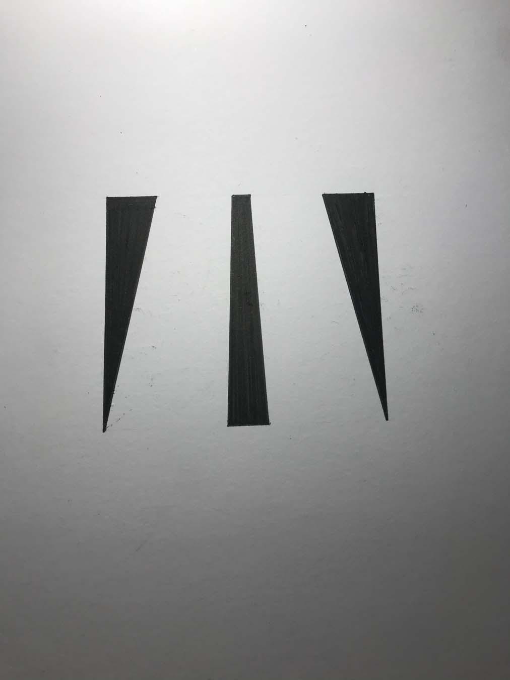
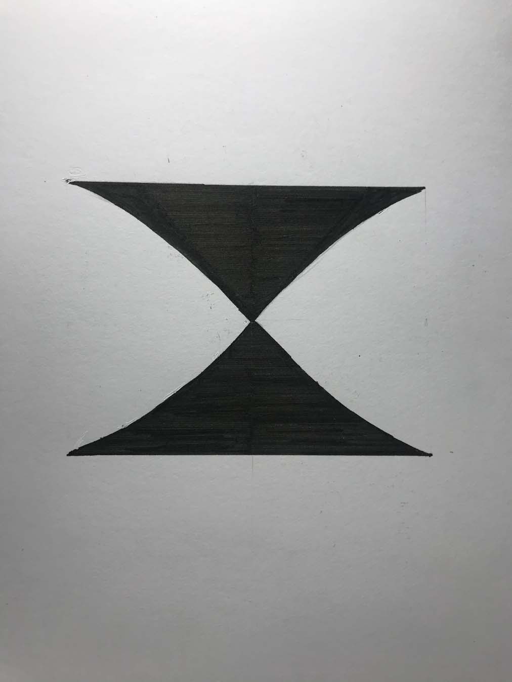
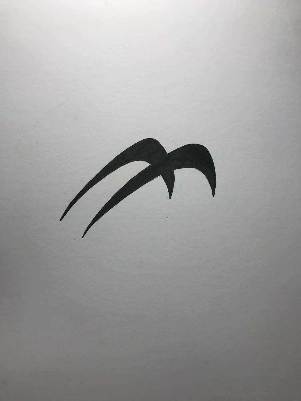
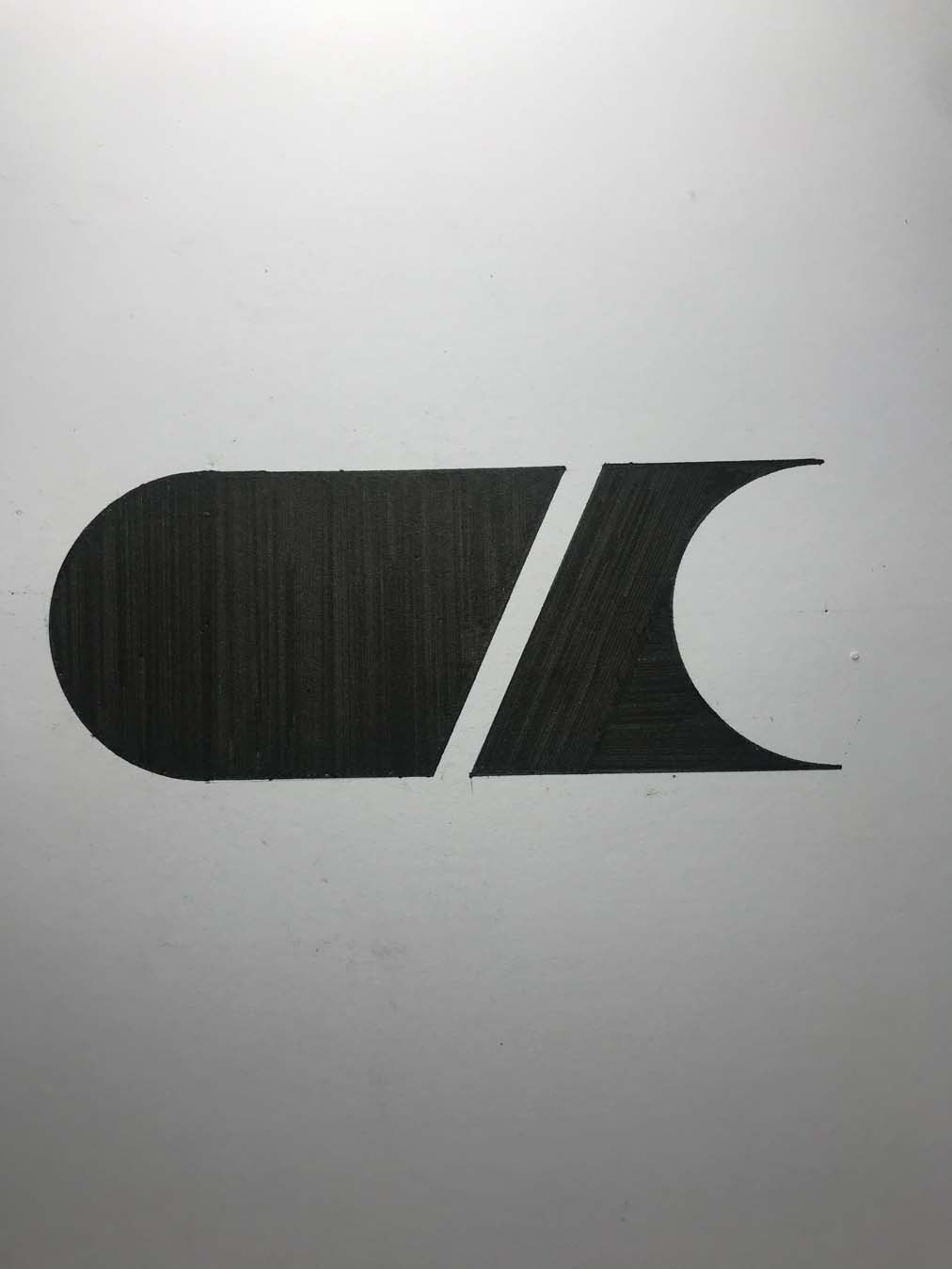
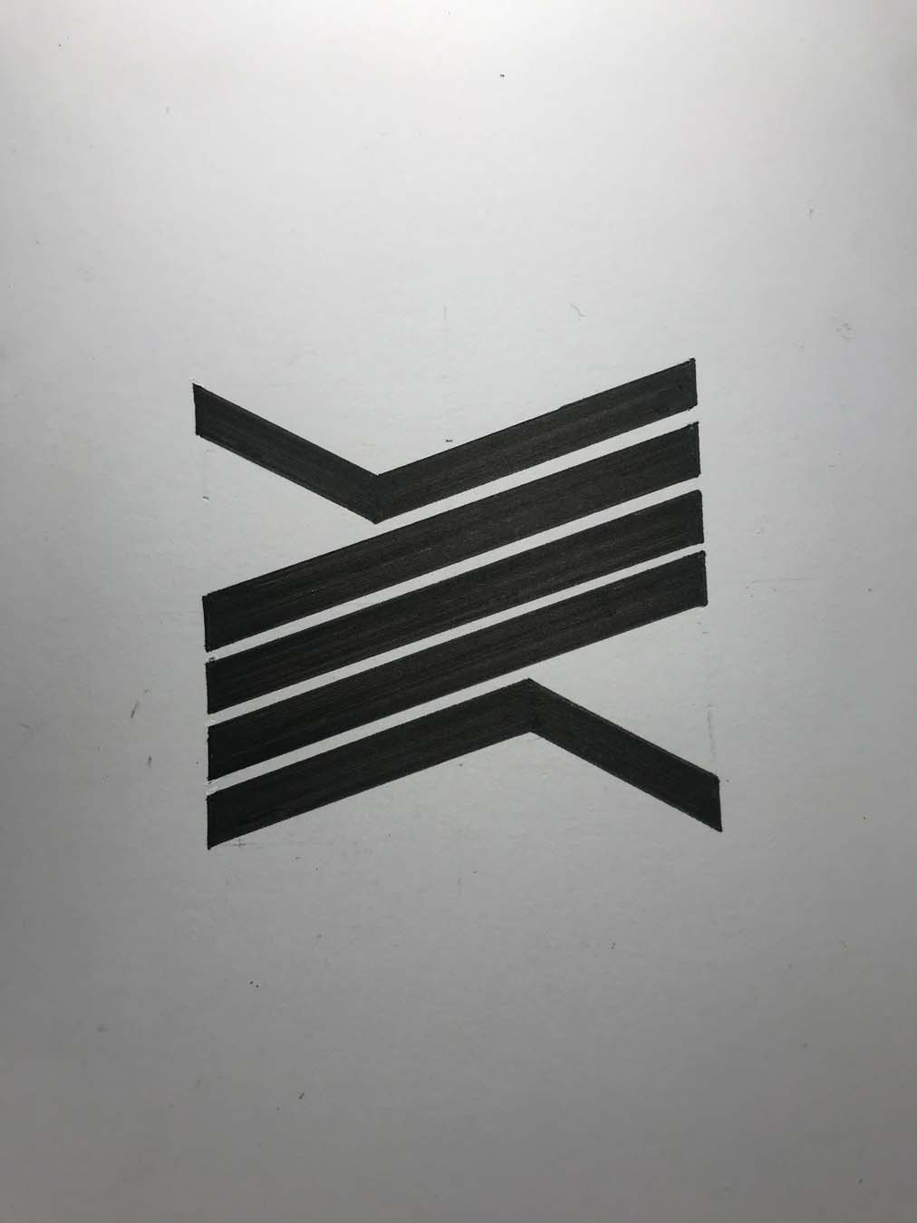
then onto pictograms, trying to embody speed and motion, as Home Lines is a transport service.
![]()
![]()
![]()
![]()
![]()
![]()
![]()
![]()
![]()
![]()


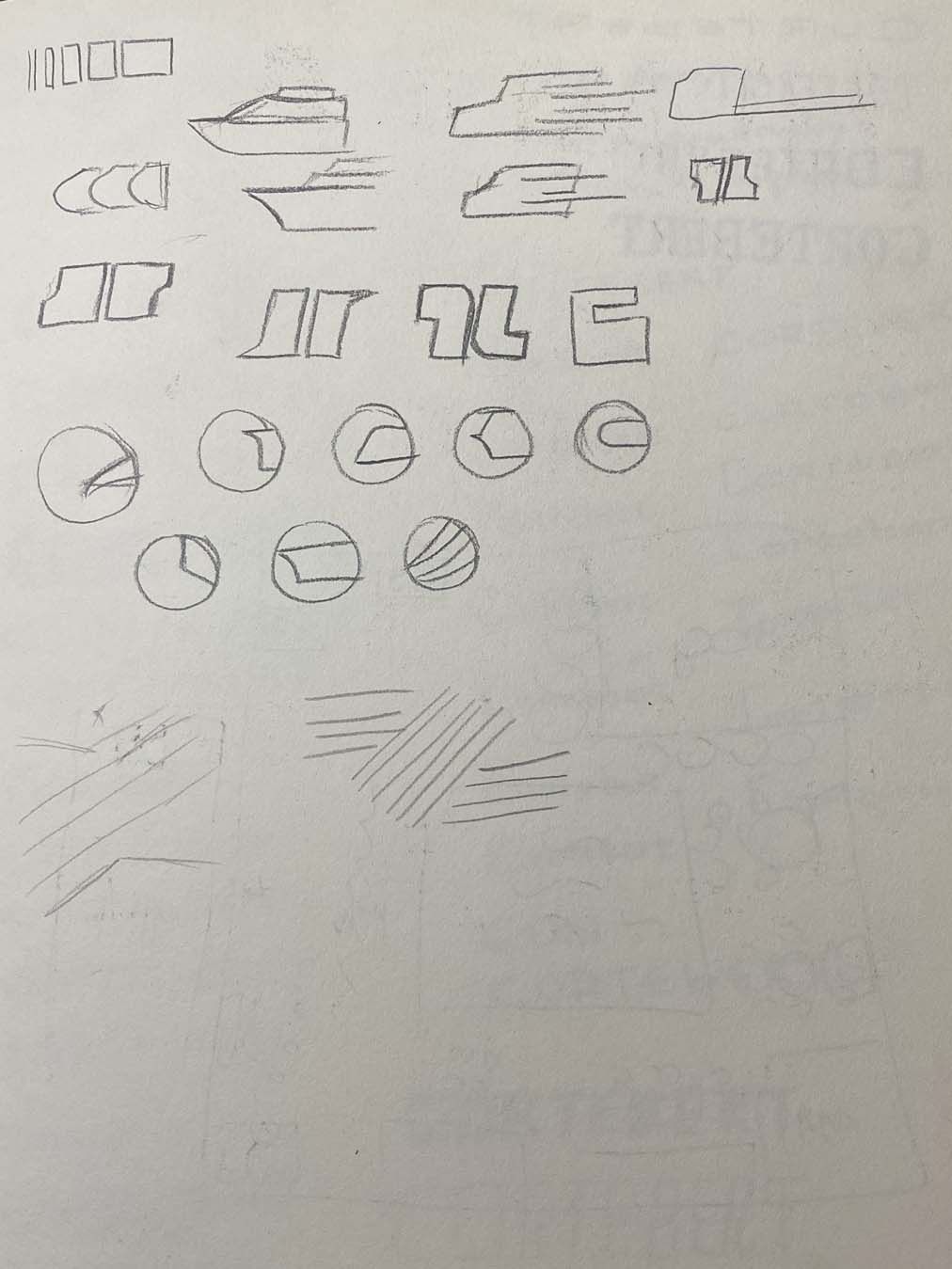
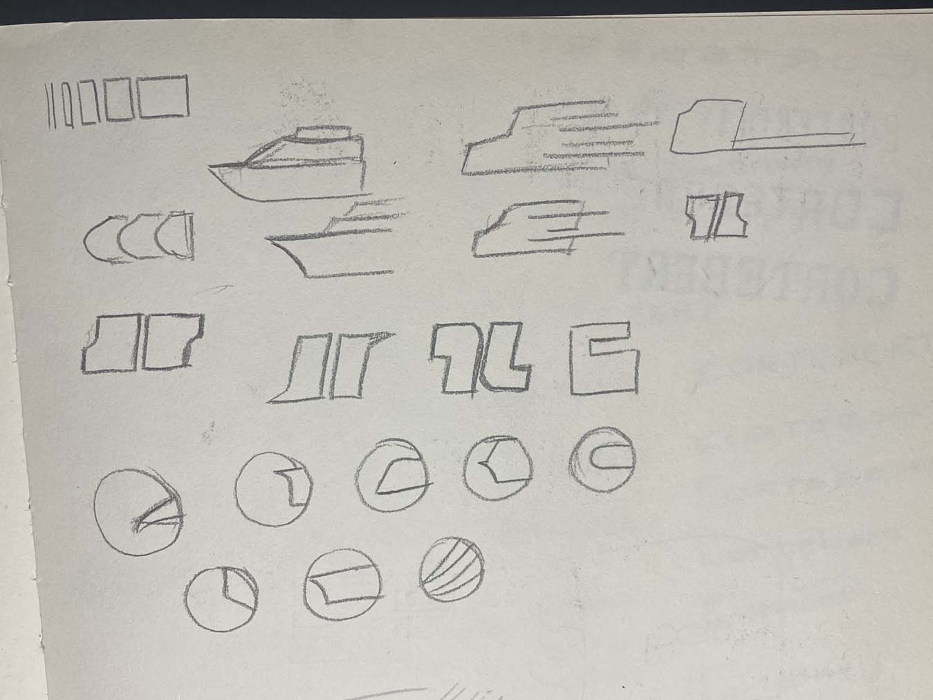
Amongst them all, 10 were shortlisted and refined.
![]()
4 of those were chosen, digitized and tweaked further.
4 of those were chosen, digitized and tweaked further.
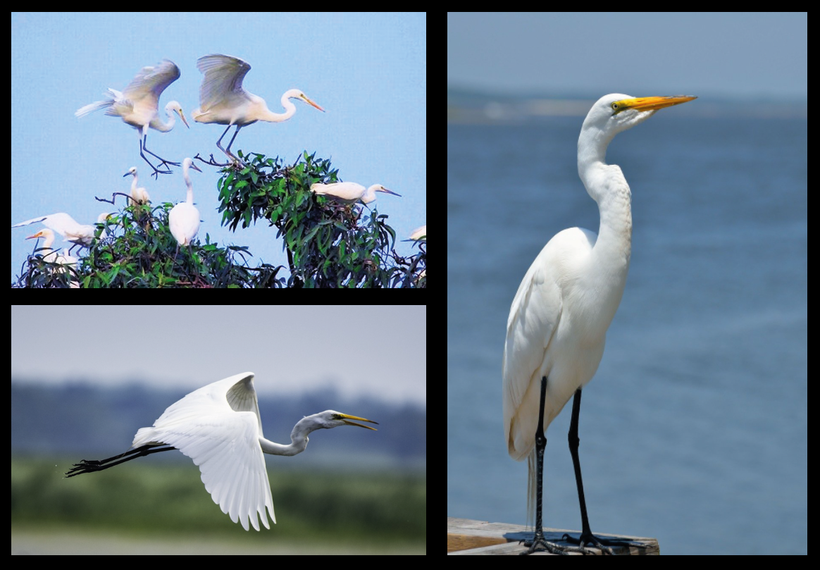
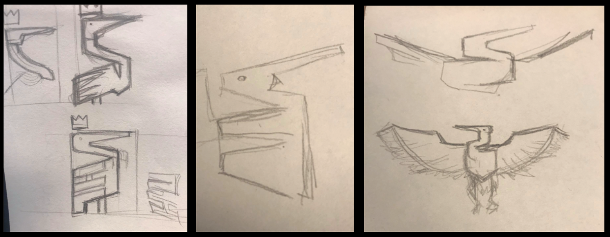
I carried on to develop the Mascot and Emblem
logos, choosing a stork for their cultural relevance in Vietnam.
I immediately thought of the “Lạc” bird in Vietnamese mythology.
Easily recognizable. and highly relevant if compared to our new brand values.
The drawback is that it is too popular, and were we to change a culture-tied symbol, would be inappropriate.
![]()
![]()
![]()
![]()
![]()
![]()
I immediately thought of the “Lạc” bird in Vietnamese mythology.
Easily recognizable. and highly relevant if compared to our new brand values.
The drawback is that it is too popular, and were we to change a culture-tied symbol, would be inappropriate.
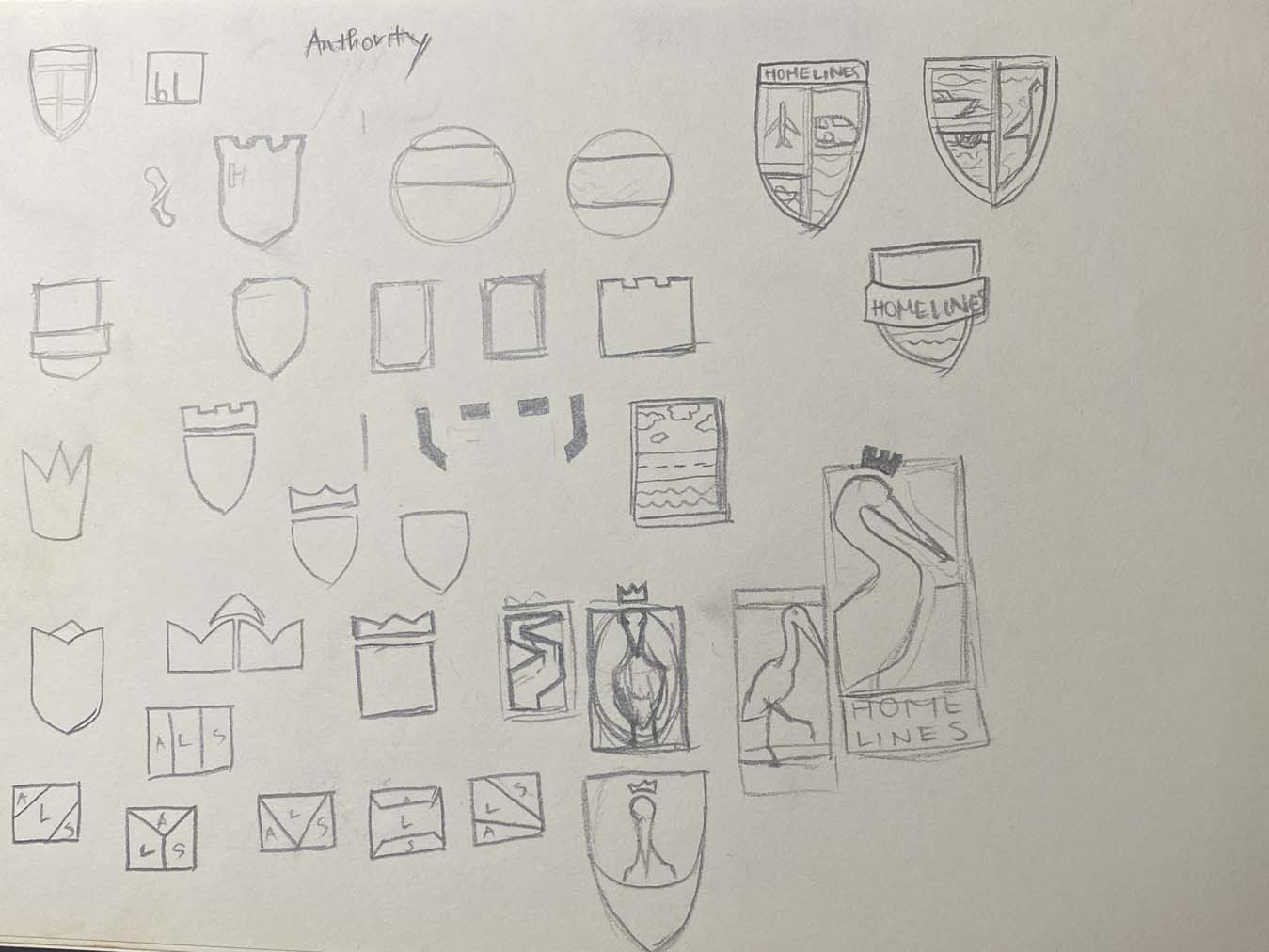
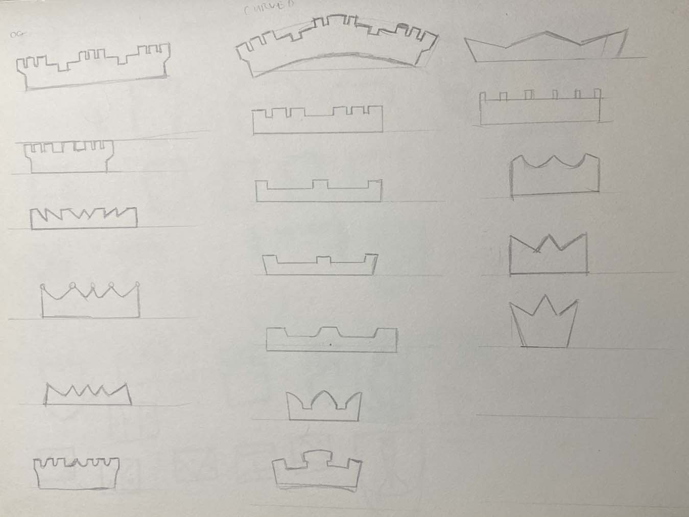
So many emblem shapes.
Well this acts merely as a foundation, not a stiff mold that stuffs everything inside.
From rectangles to shields to polygons to nameless shapes... Shields reigned supreme, alongside rectangles.
Shields, similar to crowns and castles, represented that theme of Class.
Well this acts merely as a foundation, not a stiff mold that stuffs everything inside.
From rectangles to shields to polygons to nameless shapes... Shields reigned supreme, alongside rectangles.
Shields, similar to crowns and castles, represented that theme of Class.
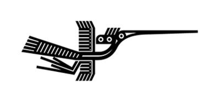
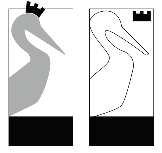
I scrapped the “Lạc” bird idea altogether.
With the S-shape of a Stork in mind, I drafted a slightly rigid and glyphic bird, with the addition of a crown on top - a finishing touch. From the start I made sure to have a bounding box on the outside, so that even when the Mascot stands alone, we can feel that it is squared-off
and has a certain foundation.
Of the many ways to make a Stork into a contortionist and fit it inside a rectangle. it was not always visually pleasing. Balancing the proportions of a Stork’s anatomy harmoniously was a big challenge.
The head, neck and beak had to be distinctively Stork-y and not drifting to be a pelican or crane.
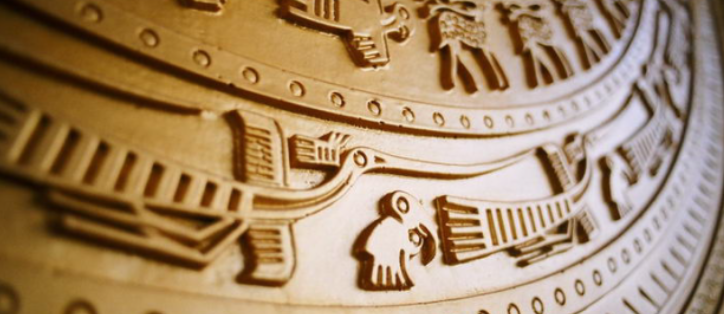
There was a moment I thought to have the bird spread its wings. Instant regret.
Resembles those motorcycles/cars emblems with artistic winged ornaments.

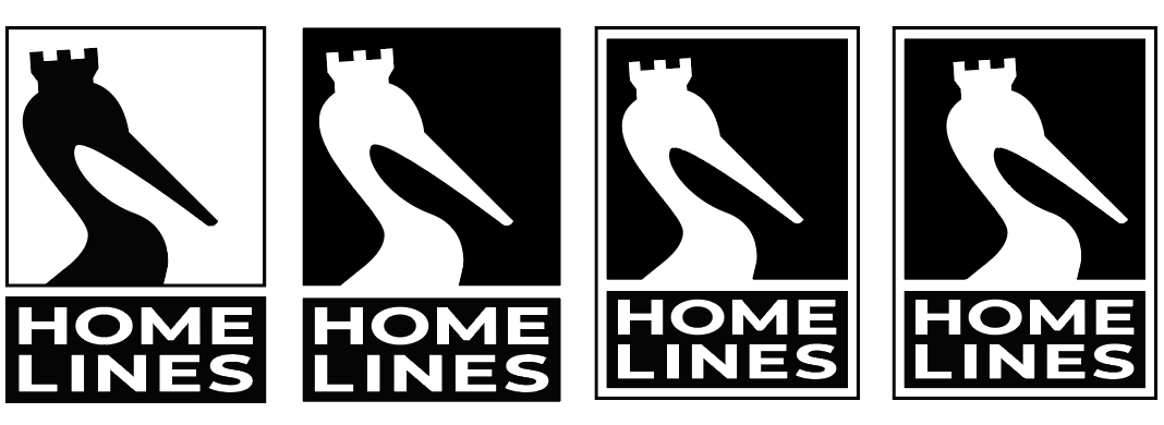
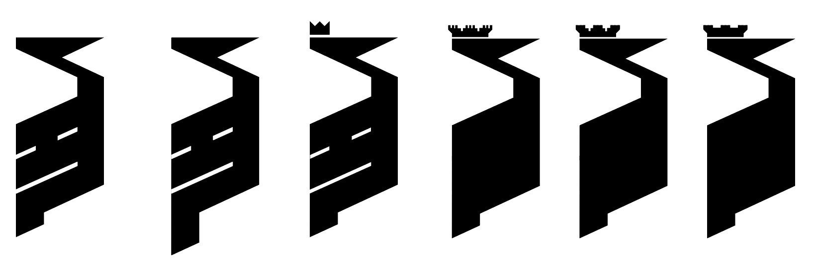
Carrying the stork onto emblem design, iterating (from left to right)

Finalized Emblem logo - also the chosen one for the whole brand

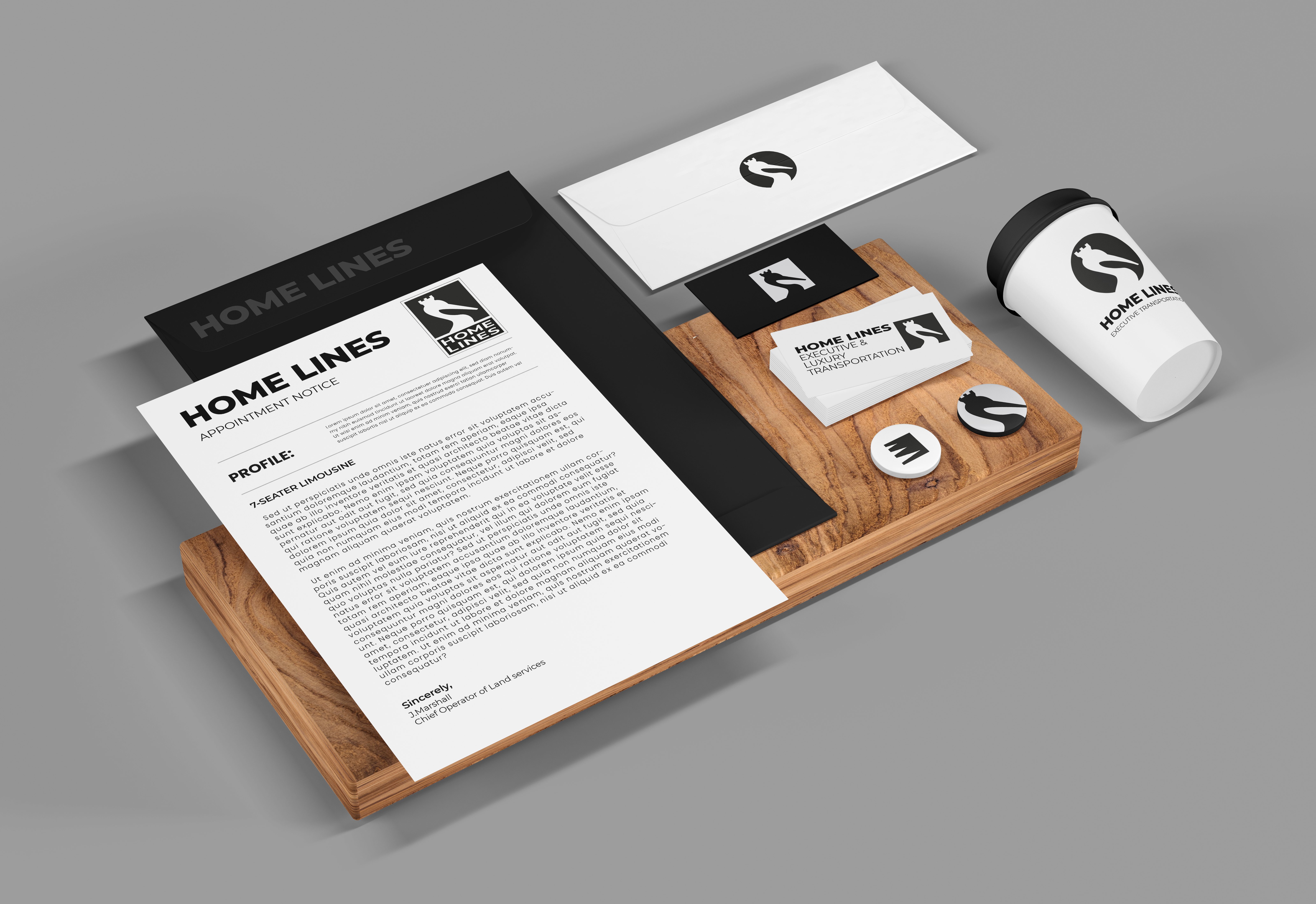
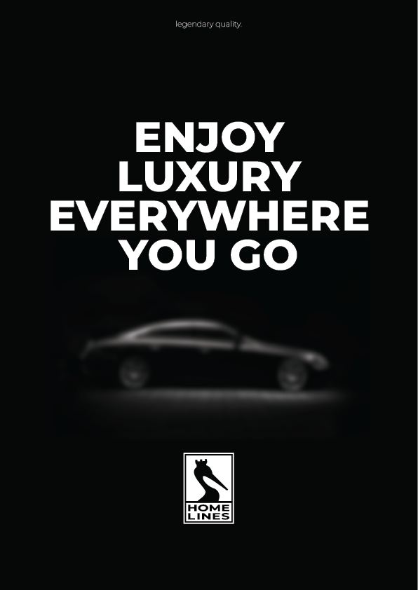
Proposed brand touch-points
> next: Granny’s House in 3D
> home